
(Tim Wood)
Here are two bespoke English kitchens that I really find smashing! They are quite different from one another. Let's take a look at the two of the a bit closer.
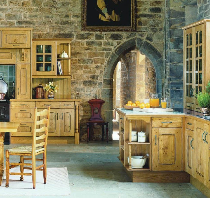
The first kitchen offers so many layers of interest. Notice how many textures are involved:
-the walls
-the wooden cabinetry
-the floors
-the furniture (the chair, in particular)
-the accessories
-the tile backsplash and counters
The second kitchen is very different from the first. I think it's the simplicity that I find pleasing. It's clean and straight forward, without being too utilitarian or clinical. This kitchen has great warmth without sacrificing function.
I wouldn't be completely honest if I didn't say that the rack/lighting over the island really bothers me. It's just distracting. What's going on with those chains? Cord covers would have made such a difference. Also, I think I would have hung pots rather than tools. They look out of scale to me. Can't you just see a few copper pot up there? An amazing chandelier would have been my choice--but they didn't ask me.
Decision time. If you had to choose, which kitchen would it be--and why?
I've made up my mind--I think!


I LOVE the first one!
ReplyDeleteWhile I do like lots of things about the second (love the color of the cabinets, the floor, and the farmhouse sink), the first one just calls to me in a way that most kitchens never will. I'm sure it's the glorious stone walls, the arched doorway, and the fact that I would be living in a castle if that were my kitchen. As an American, nothing beats a castle kitchen :)
ReplyDeleteIt's the DOORWAY I can't get past that - I would prepare food on a cardtable if I could have that arch
ReplyDeleteI love the first kitchen too! the stone walls,gothic archway,pine cabinetry-perfection!
ReplyDeletePS Just discovered your blog and I'm in love with it.
The first one is incredible and would probably suit a c.17 house the second I LOVE even mroe - it has a lot of warmth. plus I adore adore adore belfats sinks, and agas of course. Oh sigh!
ReplyDeleteIs that second one really English? It looks so very American for some reason. I am going to go with the first since it has more charm. Plus, it is likely in some big, historic house and that is so for me!
ReplyDelete*faints to the floor*
ReplyDeletereally, all I want in a 14th century castle . . . is it truly that difficult a request?
i've always been a sucker for white/creamy kitchens. but i love the stone/brick wall of the first kitchen as well. i'll take a combo of both. i know easy way out of the decision, but that is what i would want. but if i had to choose, it would be the 2nd one.
ReplyDelete***keeping my fingers crossed that p&g may be moving to our neck of the woods soon*** i'll have to get an update from what transpired over the weekend.
More lovely English kitchens!!
ReplyDeleteBeautiful - but I like number one best. Perfect for tea and scones on a rainy afternoon!
ReplyDeletenumber one has bloody brilliant character.
ReplyDeleteimagine having cereal or tea and crumpets there. ah, divine.
think it all that stone, and the table.
Wow, I love, love, love the first kitchen. All the texture, just gorgous. I'm really enjoying all these beautiful English kitchens.
ReplyDeleteI like both but if I had my pick then...
ReplyDeleteThe kitchen from the second picture in the room from the first picture!
The first one, certainly! More is always more!
ReplyDeleteThis is awful but what does Bespoke mean? And yes, optimism is the key to survival in this economy!!
ReplyDeleteok those are stunning and making me drool. someday a huge kitchen. but it's sure fun to dream! thank you for your constant prayers, comments and encouragement. they really mean so much to me. hugs, christi
ReplyDeleteThank very much for the very kind comments on the David Hick's kitchen we installed in 1989/1990. You seem to have a "?" where the picture should be, if you would like this or other pictures please let me know.
ReplyDeleteAlso we now have an office in California.
Kind regards
Tim Wood
Thrilled to hear from you, Tim Wood. Please leave me your contact information. I would really like to feature your work here. You may email me at GrannySmithGreen at Gmail dot com. I look forward to hearing from you again!
ReplyDelete